

Redesign for World Wide Technology’s Go-To-Market Internal Website
Overview
The Managed Services team within World Wide Technology sells technology packs to clients to solve their technology problems. Employees visit an internal website to learn more about the services WWT’s Managed Services team offers. My role was to redesign an internal website that presents information to drive sales.
Problem
The existing Go-to-Market website was unorganized and hard to read, causing confusion among clients and their respective project managers about what services are offered. This was leading to miscommunication and delays in sales processes.
-
My Role
To audit, wireframe, redesign, and publish a redesigned internal website that concisely presents technological package information to drive sales
-
Users
Internal employees
-
Timeline and Tools
June 2022 - August 2022 (2 months)
Internal web page builder, Adobe XD
UX Audit
First, I audited the existing Managed Services Go-to-Market website to understand what user needs were not being met.
I audited the existing website by using Nielsen and Norman’s usability heuristics. I found 3 key issues:
There was too much information on the page, which overwhelmed users and caused confusion about what is most important
Links to important resources were hidden or took users to the wrong pages, further confusing users
Images did not relate to the text on the page, adding clutter to the page
As a result of my audit, I concluded that there are 3 main things I would have to tackle in my redesign of this page:
Reduce the amount of information shown on the page
Edit and reorganize links so that they point to the correct resources
Select new images that correspond to the text
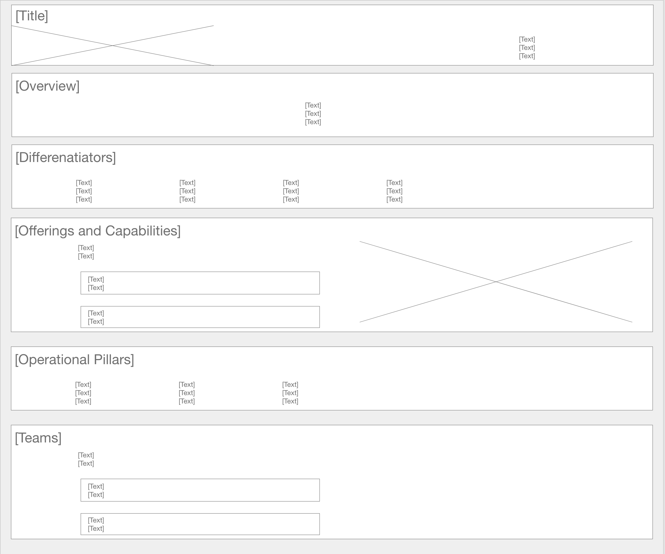
Wireframe
Next, I wireframed what the new website could look like.
I created wireframes in the early stages of the project to visually lay out the content on the new website and obtain approvals before moving on to high fidelity mockups. In my wireframes, I showed:
Clear sections for text and images, grouped by common topic
Shortened paragraphs of text so that the user doesn’t become overwhelmed with information
The use of expanded menus (accordions) so users can explore more information about certain topics
Website Redesign
Next, I redesigned the website right within the design editor itself to include all of the necessary changes.
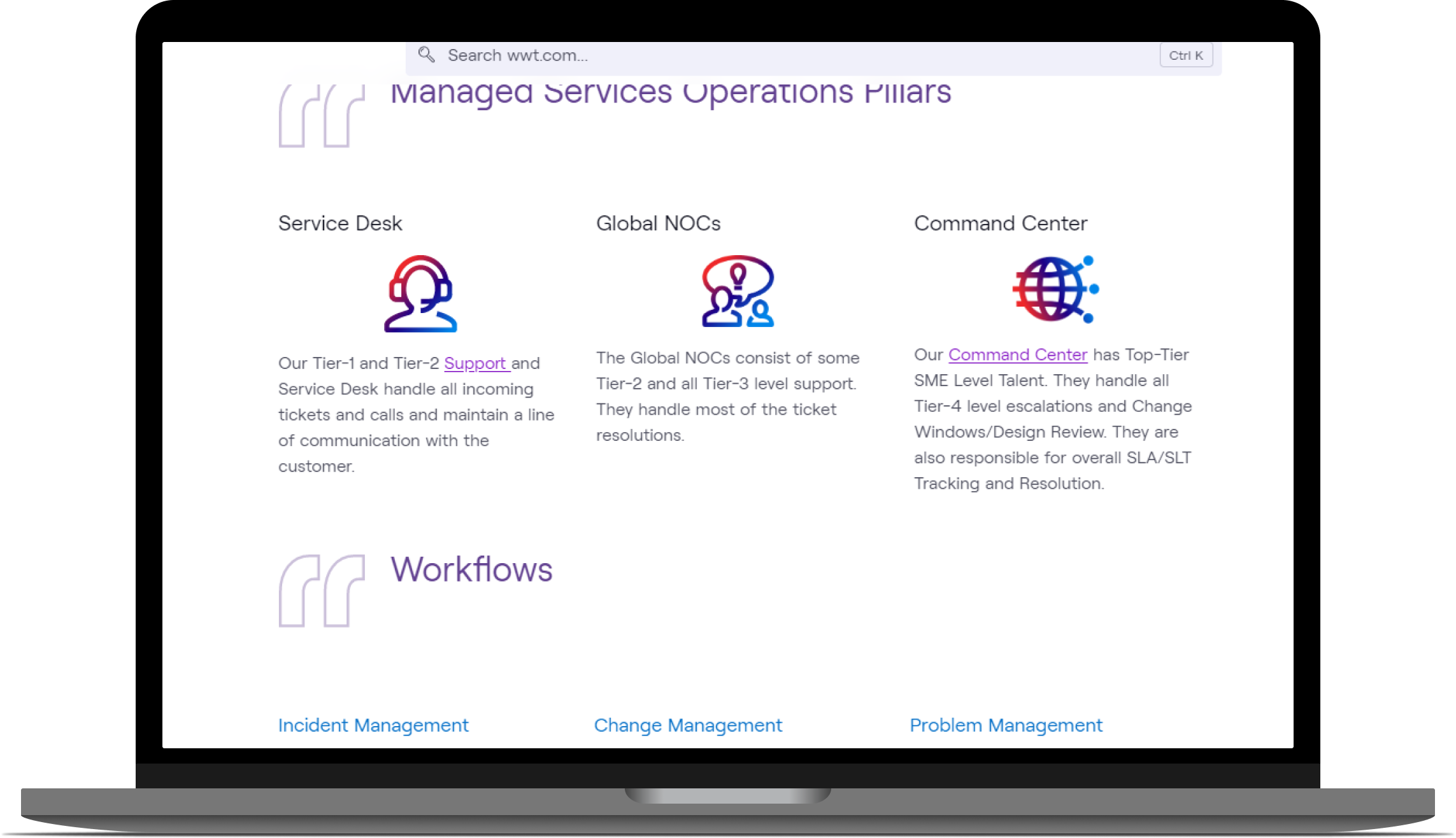
First, I redesigned the “Overview” and “Differentiators” sections of the website so that users could understand how the Managed Service process works.
-

Before
The sections were verbose and long. Users would avoid reading such long sections and have a hard time understanding the main idea of the section. The images on the page did not reinforce any of the information the user was reading.
-
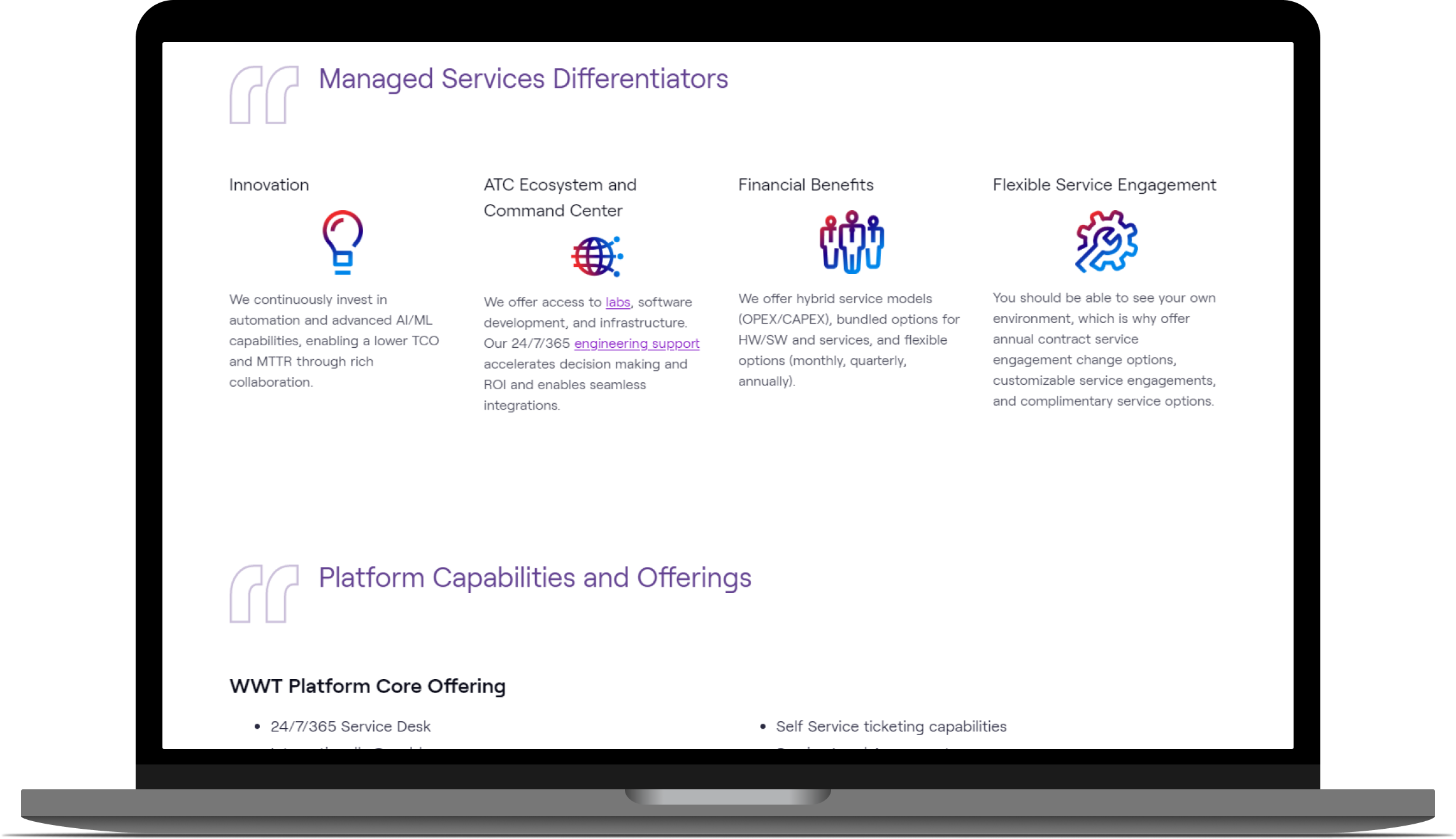
After
I condensed the amount of information on the page and made it easier to read and understand. I chose icons that reinforced the main idea of the content. All of this helped users feel less overwhelmed when reading the page.
Next, I redesigned the section of the website related to services and entitlements, so that users could clearly understand what we provide and what could be added on to their services.
-

Before
There were long lists of what is included in a technology package and what can be added on, overwhelming sales teams. This led to lots of questions from both sides and wasted money about what services can be offered with what package.
-

After
I redesigned the page using columns so that there was no confusion as to which service was offered with which package. I added a new section for clients who want to add services to their existing package.
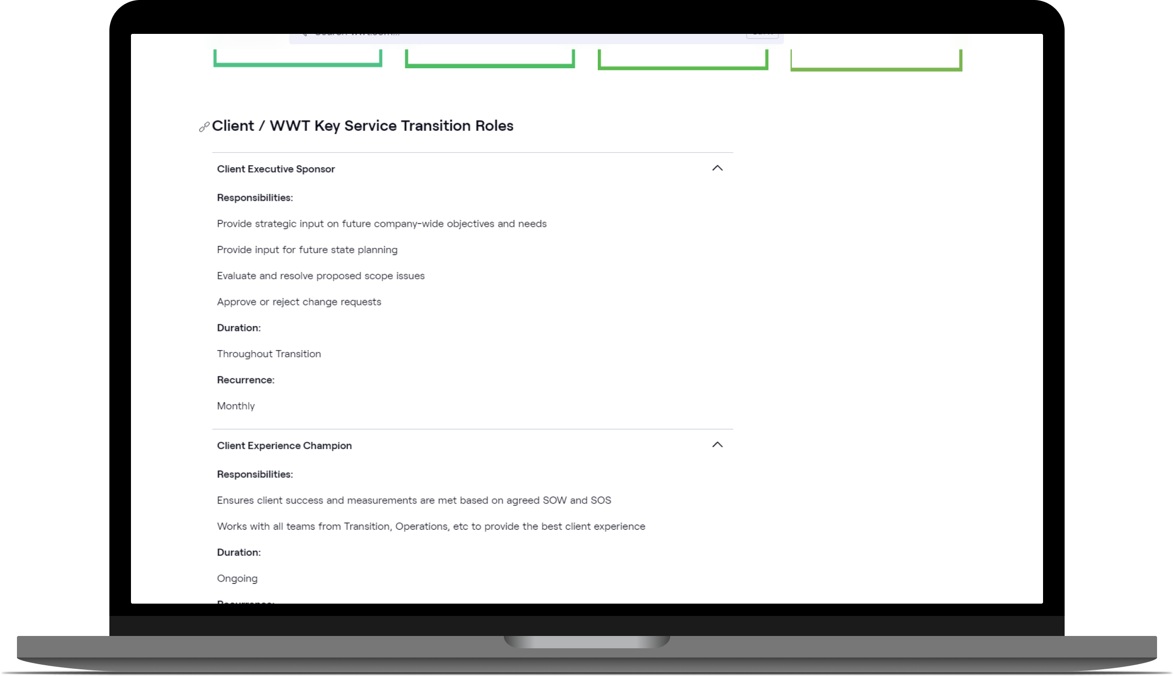
Third, I redesigned the team members section so that users could clearly see which WWT employees were in which department, allowing them to easily find who to turn to in case of questions.
-
Before
Users could not understand what role was part of what team and did not know who to reach out to. This caused them to reach out to the wrong person, and sometimes even delay their technology service, resulting in lost time and money for the company.
-
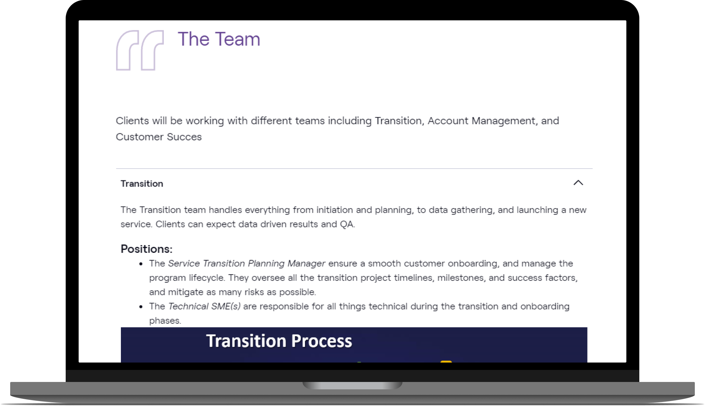
After
I grouped all of the teams by sub-department and put all relevant roles within the sub-department in an expand menu so that users can clearly understand what falls in each sub-department and role.
Lastly, I reorganized the links so that they take the user to the necessary pages. I also made the links easier to find.
-

Before
The links were hidden and didn’t redirect users to the right page.
-
After
I put links in their own section and ensured they redirected users to thee right pages. The links were emphasized using a bright blue color so that the users can easily identify them.
Outcomes
The website has been published.
“The website looks cleaner, more organized, and flows logically. It is much easier to find what we are looking for and the sections are clearly defined.”
— Managed Services Team Member
The redesign allowed users to:
Clearly see sections of text and images, allowing users to find the information and resources they need quickly, resulting in faster sales processes
Explore more information about team members and processes through accordions, resulting in seamless communication and shorter delays
Constraints
The WWT website uses an internal page builder that has limited design options. I wanted to design a heavily customized website, but because the internal page builder couldn’t support that, I had to use out-of-the-box widgets. Even though the website wasn’t as customized as I hoped, I was still able to deliver an easy-to-read page that met users' needs and eased communication during the sales process.